Kyo - Koinobori
Logo / Flyer

A refined Japanese restaurant where seasonal flavors meet the aroma of charcoal grilling. KOINOBORI offers an elevated dining experience with “genshiyaki,” carefully curated dishes, and a selection of premium sake and wines in a modern–meets–traditional space.

client
role
time line
The Ask
The restaurant sought a design that balances sophistication with an approachable casual feel—something refined enough for its slightly higher price range, yet inviting to a broad audience. They wanted a distinctive, original identity that felt modern while still aligning naturally with Japanese cuisine.
The Idea
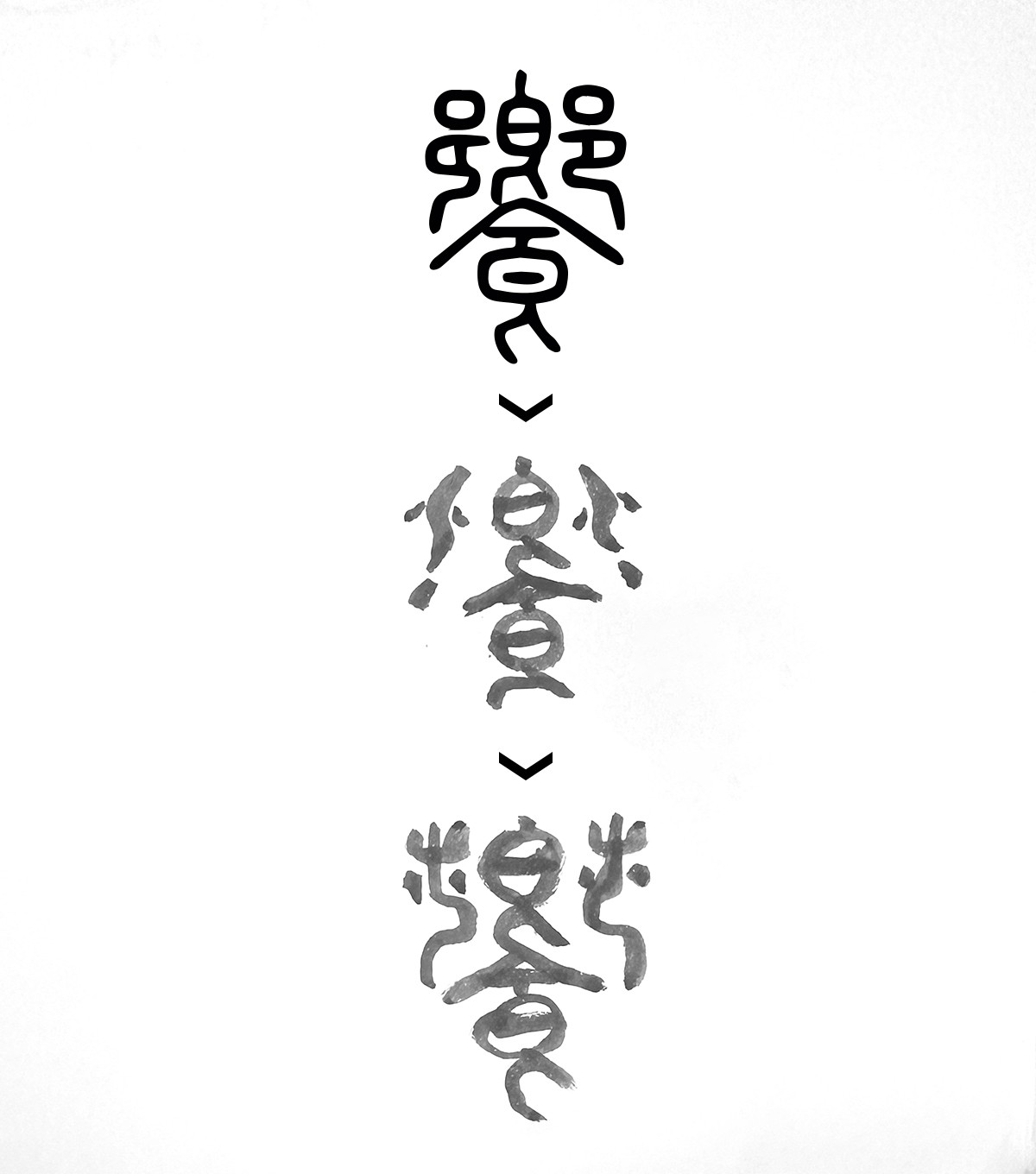
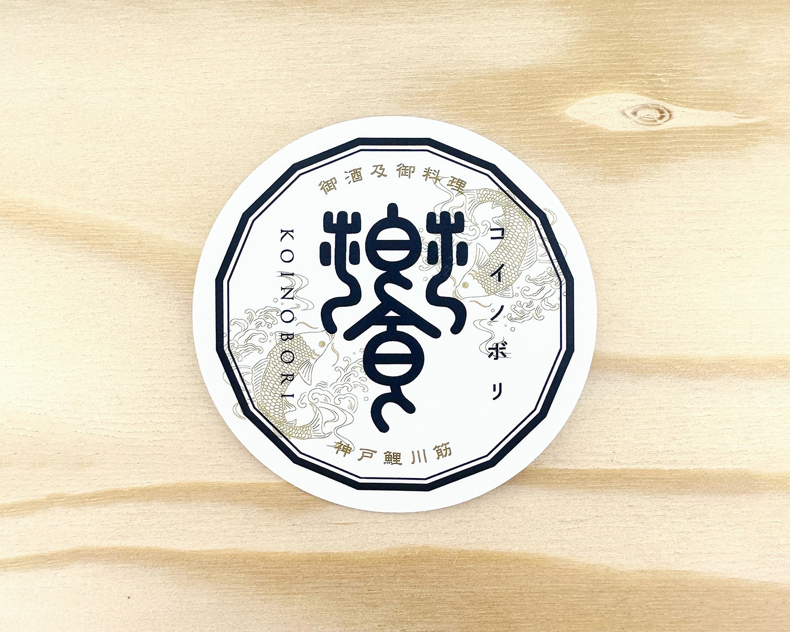
I began by exploring the meaning behind the character “饗,” which relates to serving food and gathering to enjoy drinks and meals. This led me to study its origins and old character forms. I also researched the symbolism behind koinobori and their cultural associations, looking for ways these elements could inform unique logo concepts.
The Design
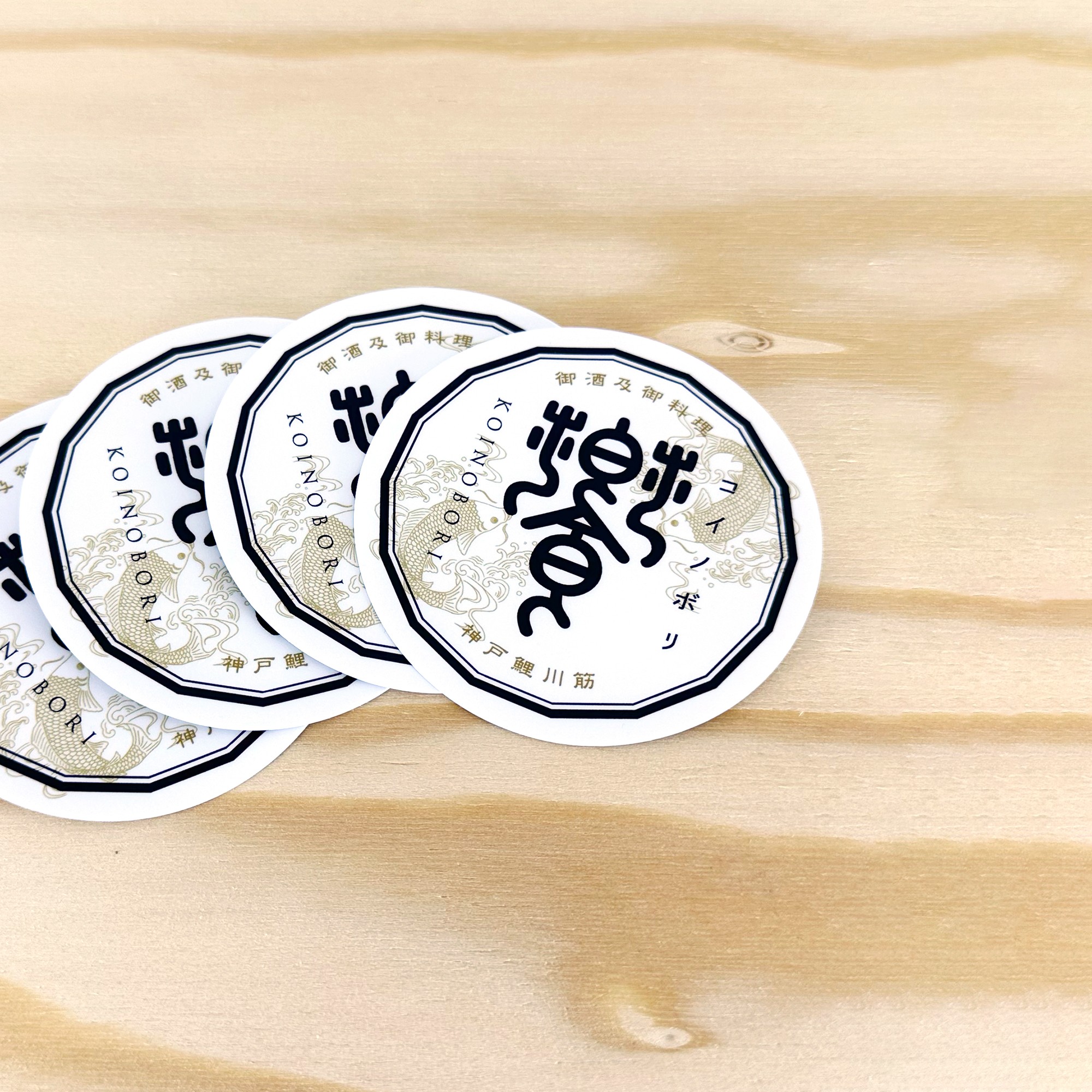
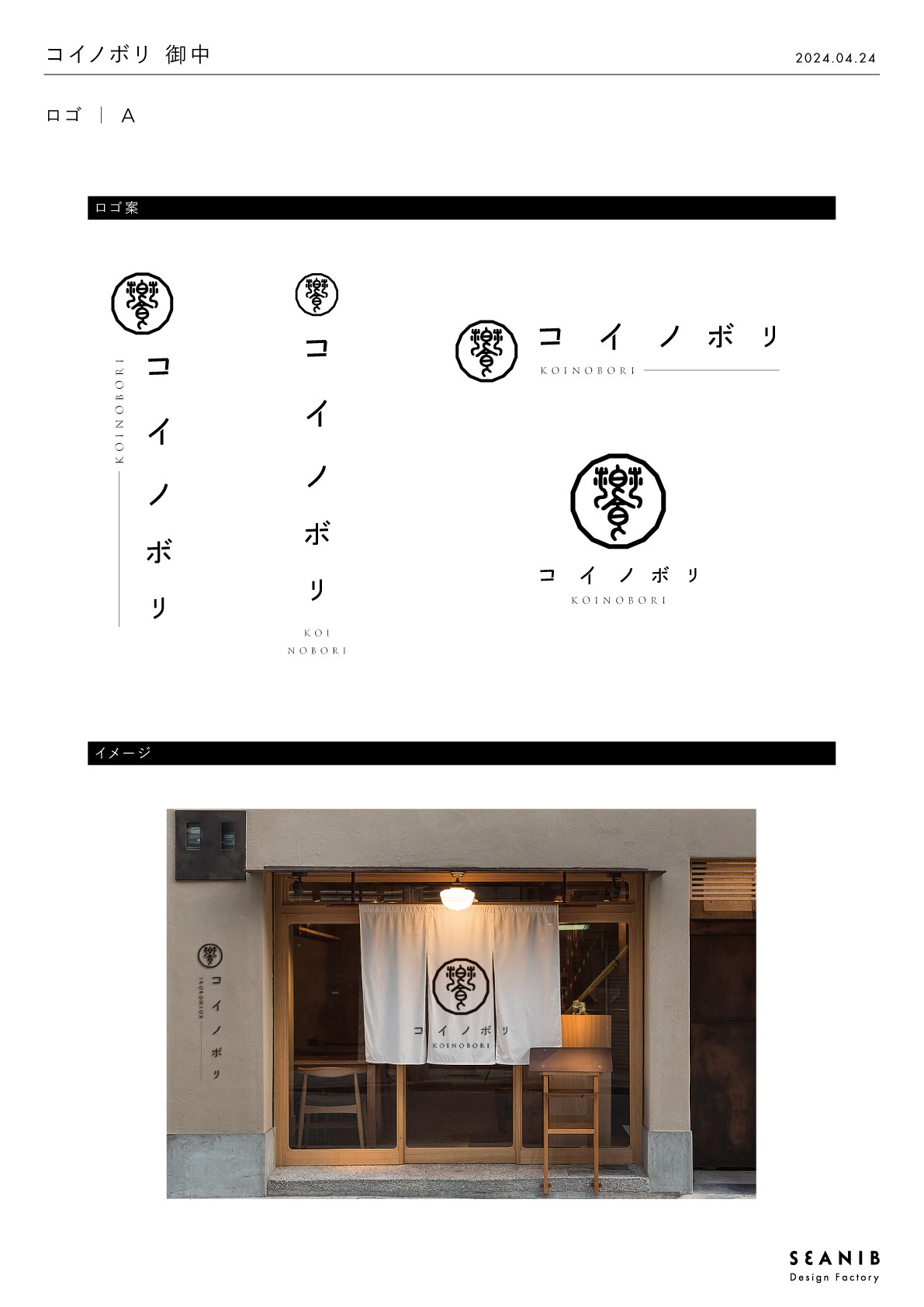
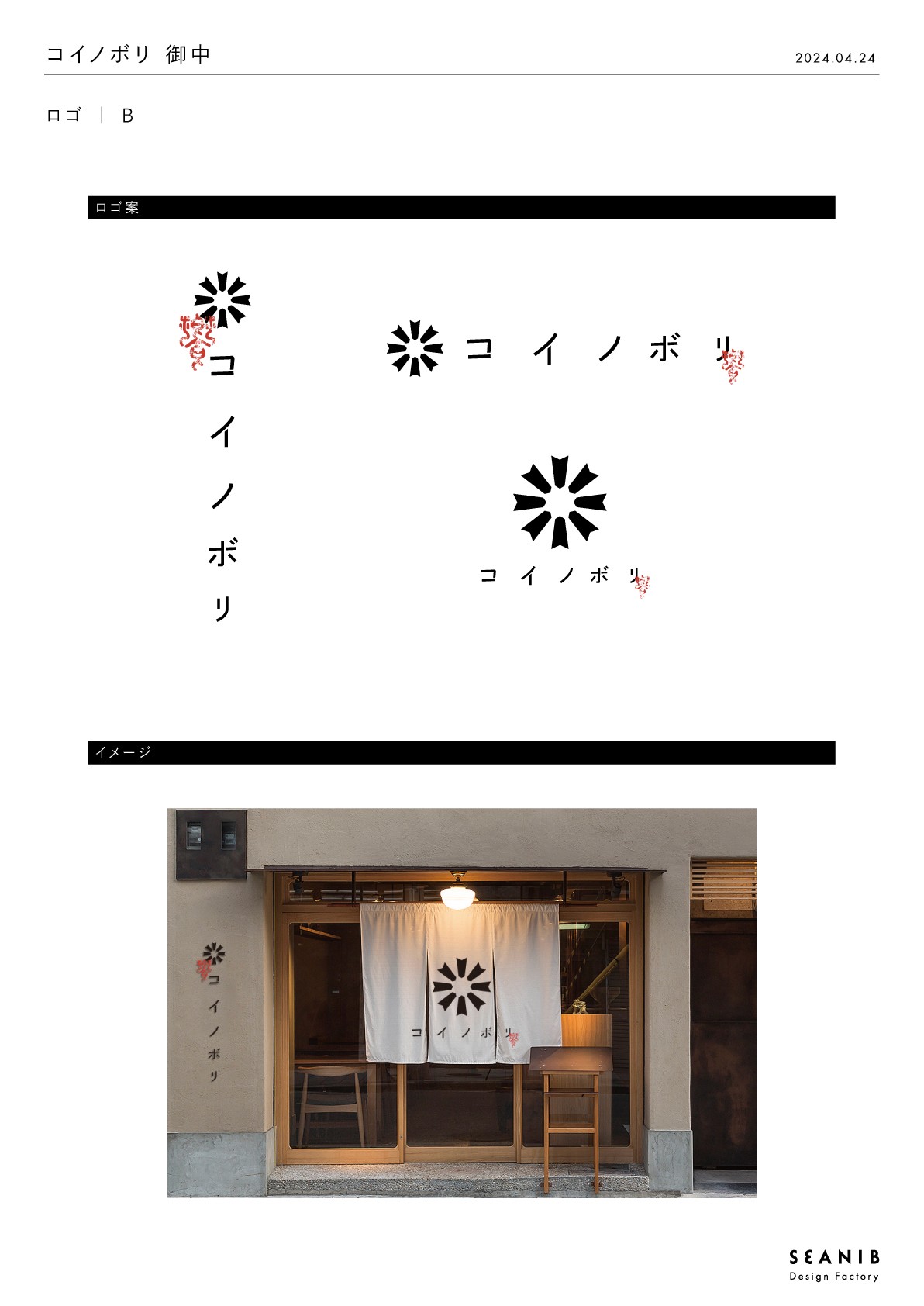
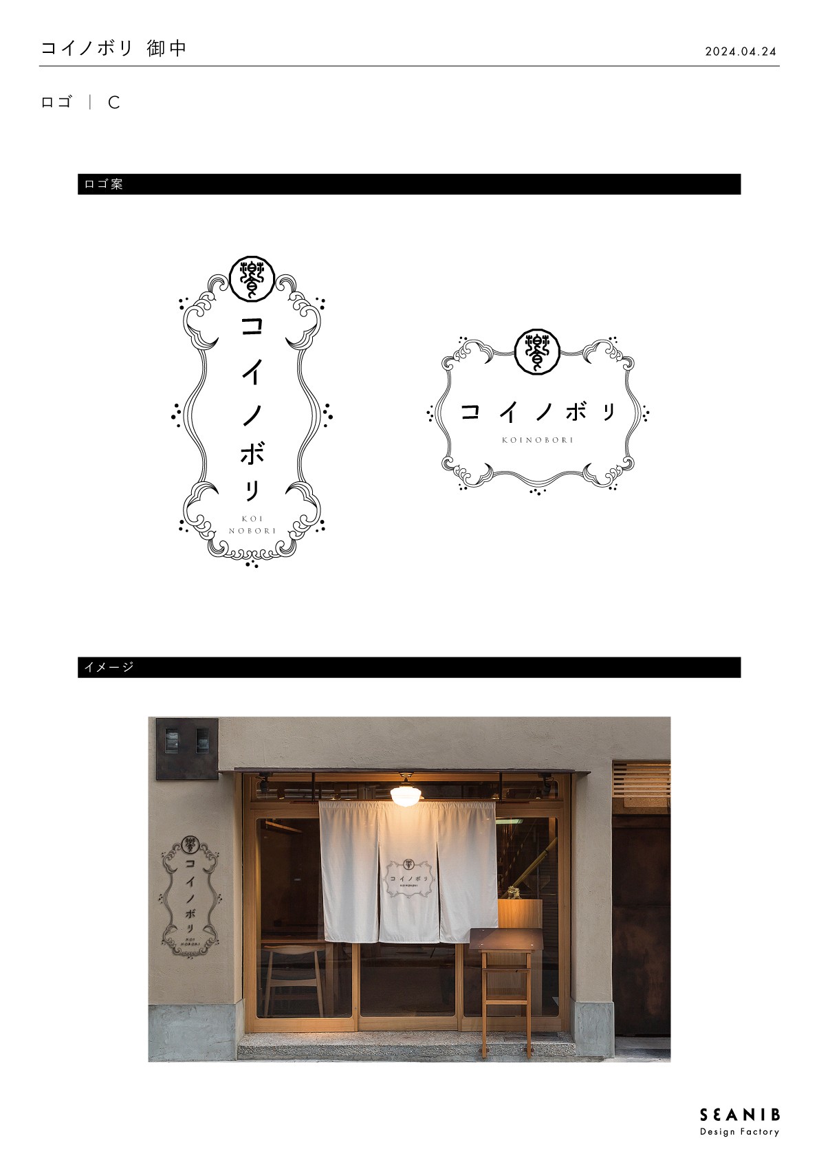
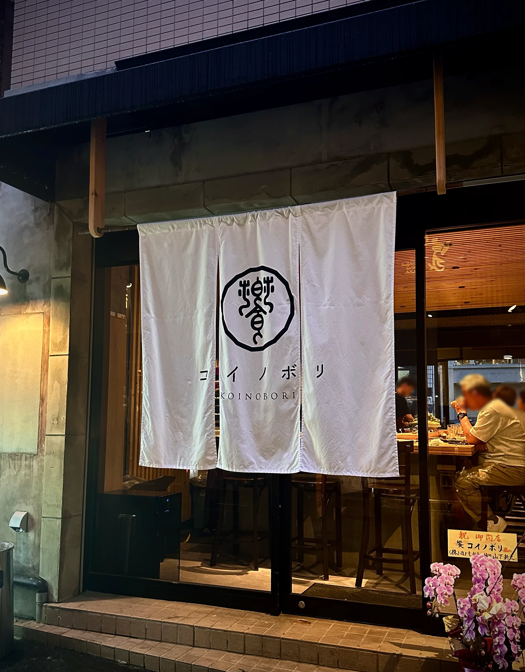
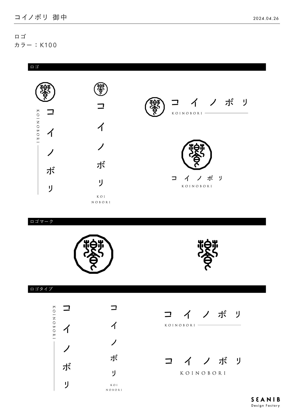
Logo
To express the roots of “饗,” I incorporated ancient character elements and crafted an original letterform, subtly shaping part of the character to resemble a koi. The logo mark features a motif inspired by yaguruma—the decorative wheel on koinobori—symbolizing protection, good fortune, and welcoming guests. For the “KOINOBORI” wordmark, I chose a clean, modern sans serif to bring a contemporary balance to the traditional elements.
Flyer
For the first-anniversary lunch launch, I created a flyer that communicates both gratitude and the start of the new lunch service at a glance. The design blends a luxurious atmosphere with clear, easy-to-understand messaging.

The Result
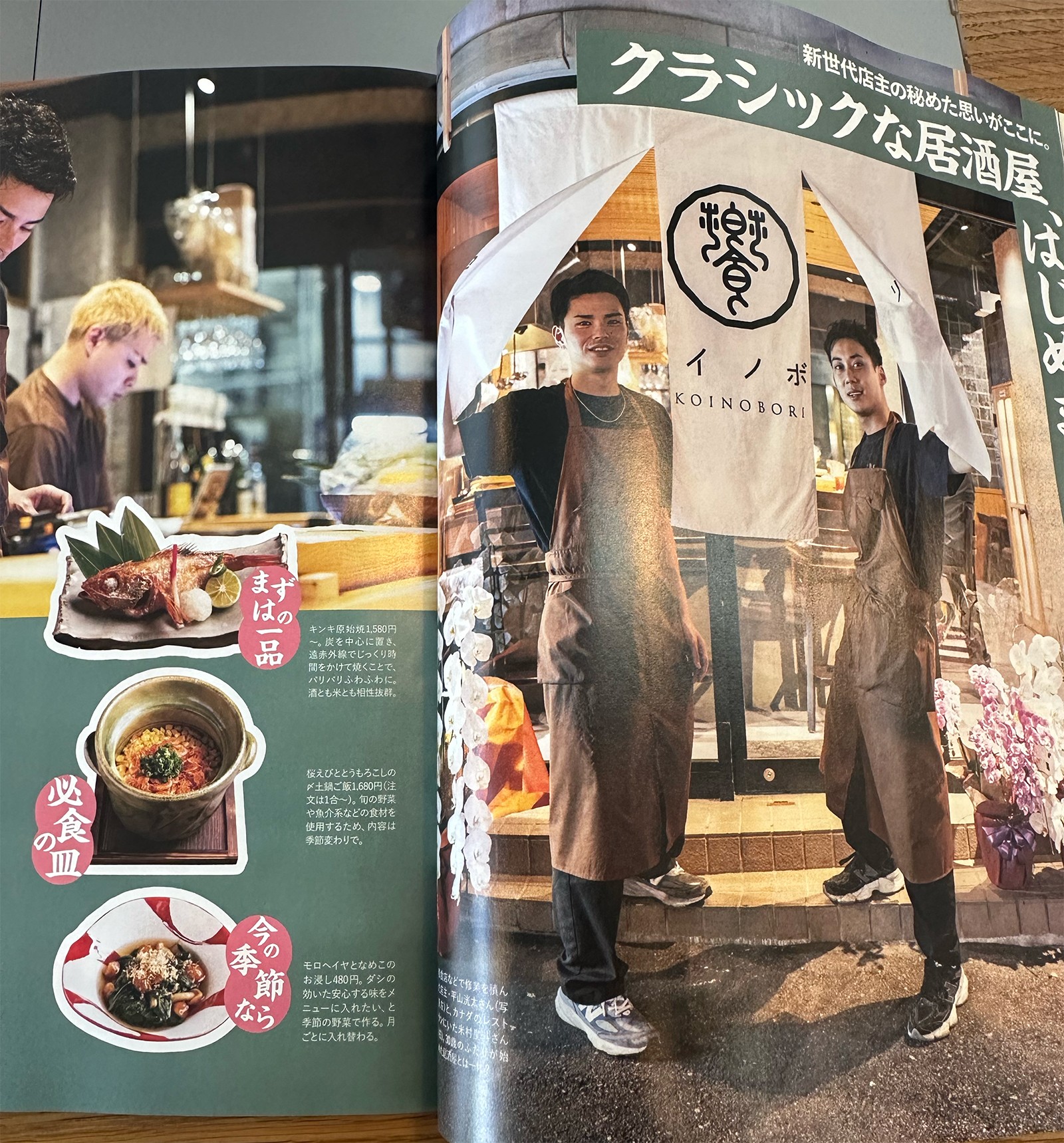
Since opening, the restaurant has grown into a popular local spot, now attracting over 2,600 followers on Instagram. It has been featured in magazines several times, contributing to rising recognition and sustained popularity.